Dr. Michela Rosado - Rebranding and Website

Rebranding, visual identity, stationery and website for an ophthalmologist in Brasília: a calm, precise and human brand.
Client
Dra. Michela Rosado
Category
Branding & Identity
Year
2026
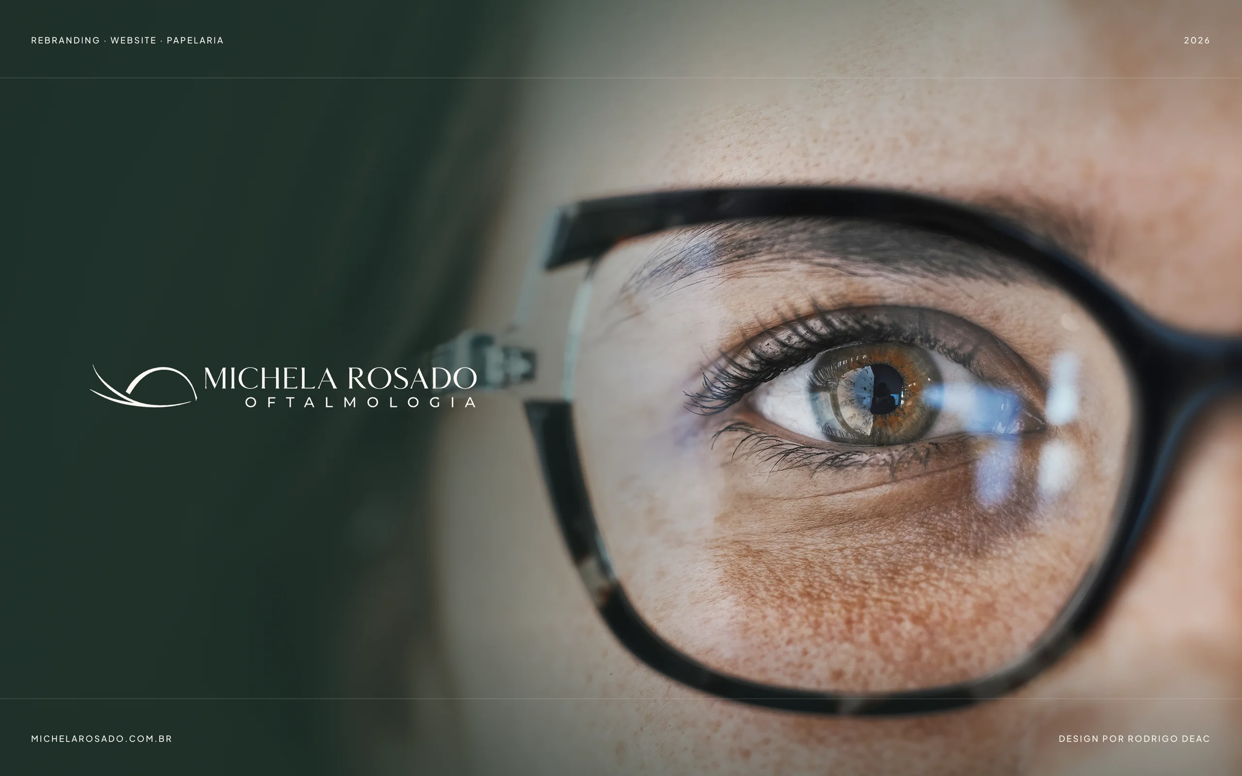
Cover: new Michela Rosado Oftalmologia logo over green duotone photography

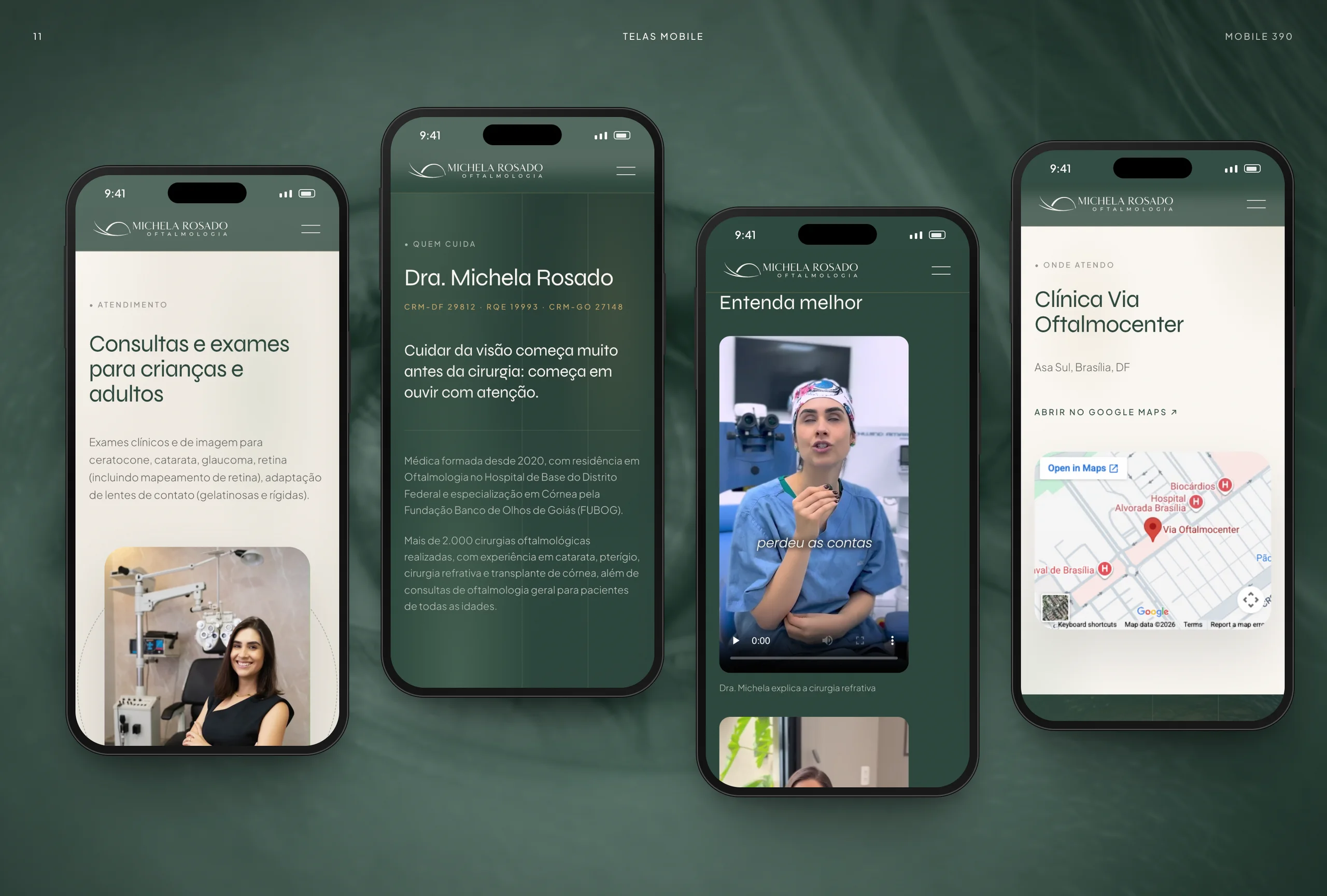
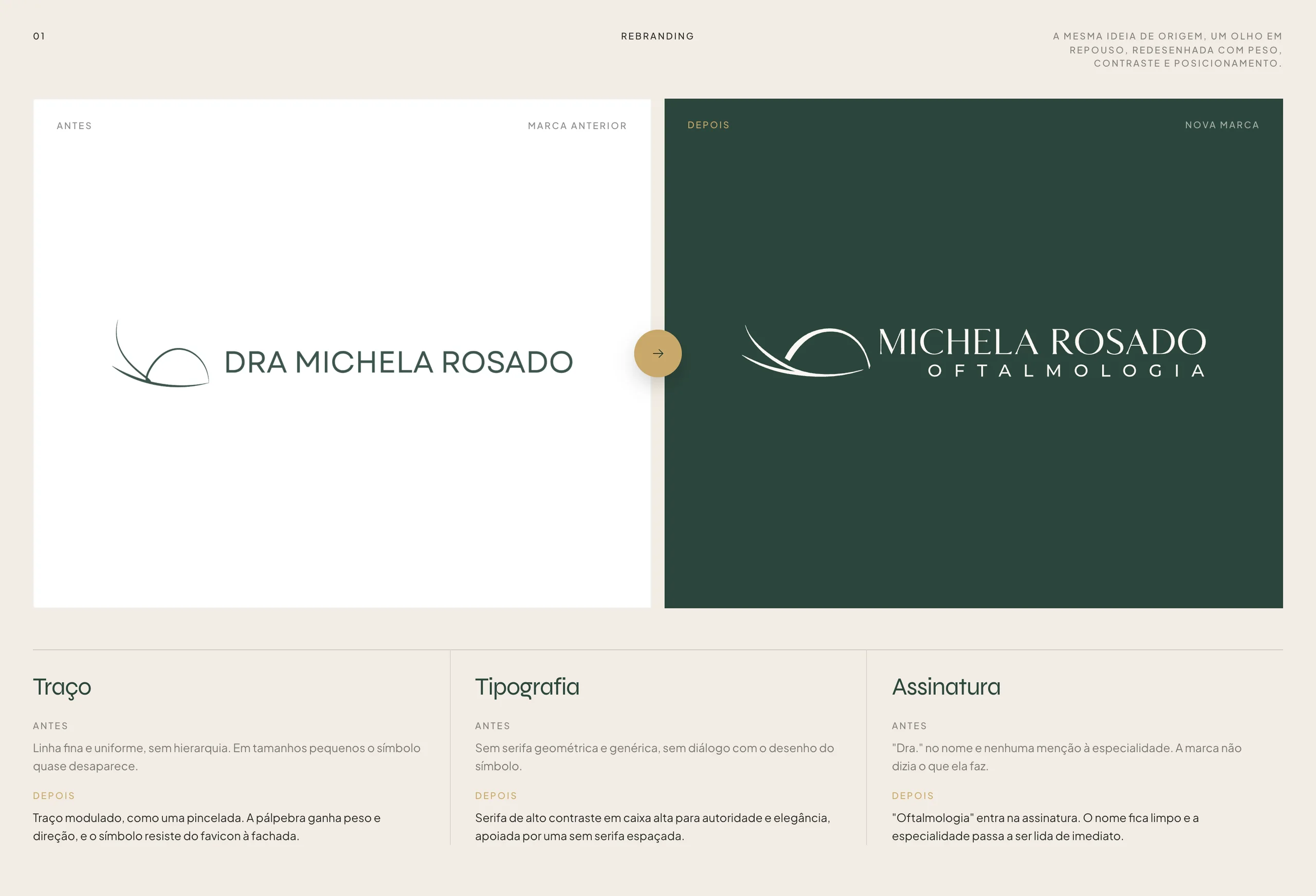
Full rebranding for Dr. Michela Rosado, an ophthalmologist specialized in cornea and cataract. The resting-eye symbol was redrawn with a modulated stroke and the signature now reads "Oftalmologia" in a high-contrast serif. The system pairs deep green, subtle gold and ivory white, and unfolds into stationery, signage and the michelarosado.com.br website: a homepage and four procedure pages, designed mobile first for visitors coming from paid traffic, compliant with Brazilian medical advertising rules (CFM 2.336/2023).
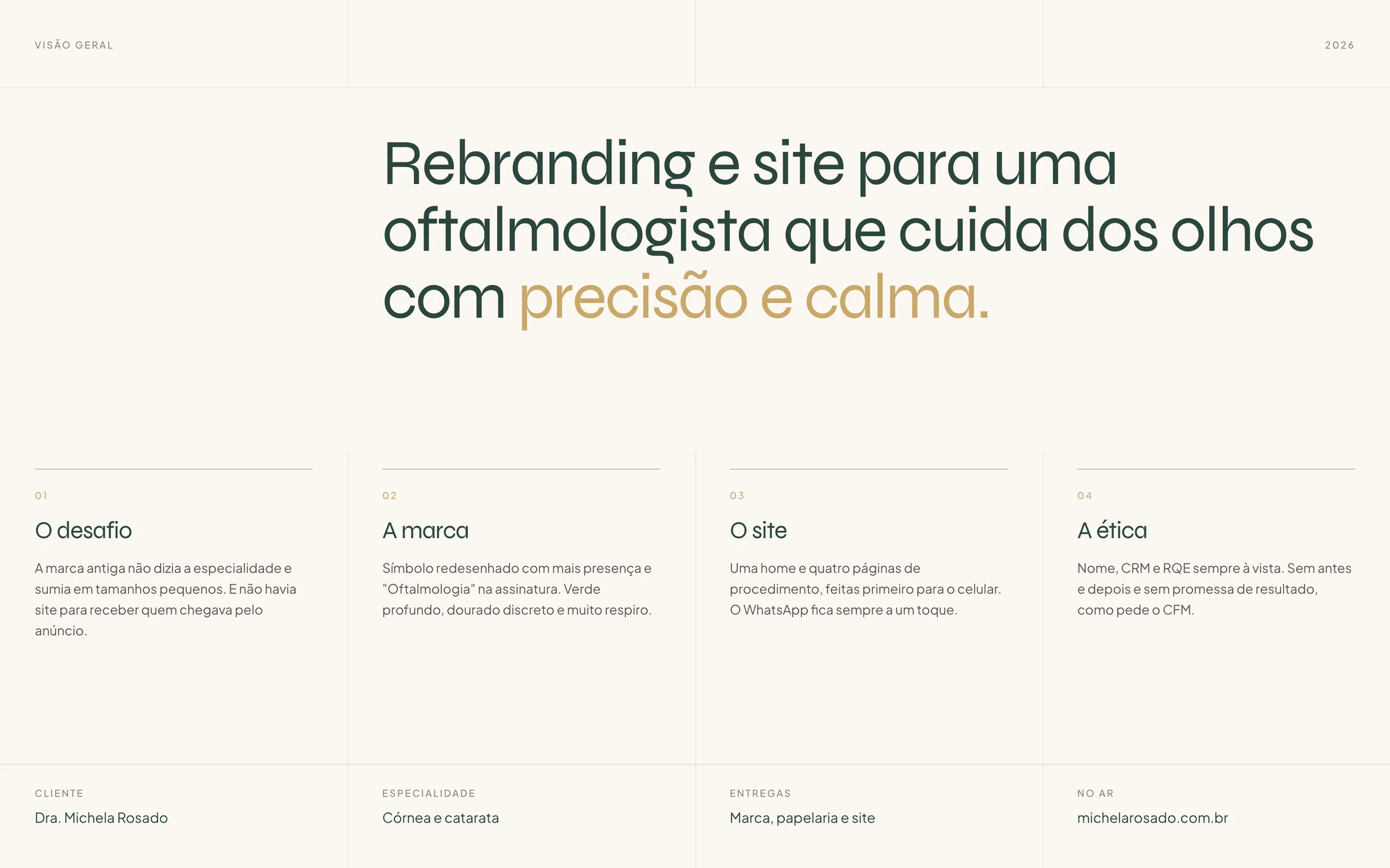
Project overview: challenge, approach, website and medical ethics
Rebranding: old and new logo side by side
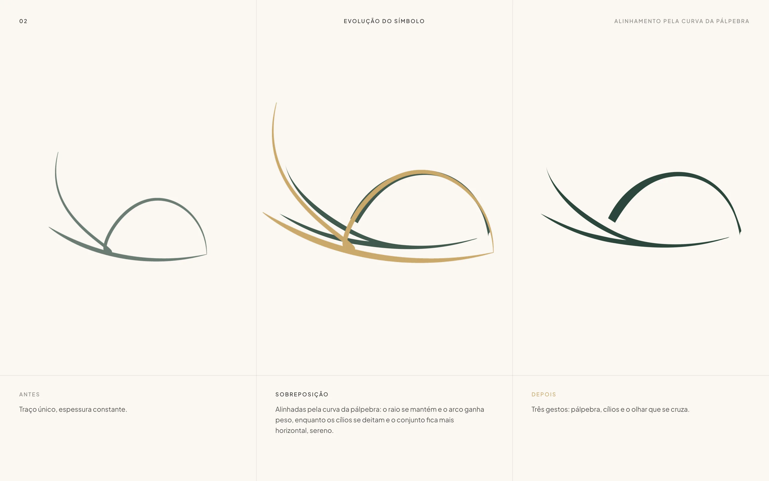
Symbol evolution: before, overlay and after
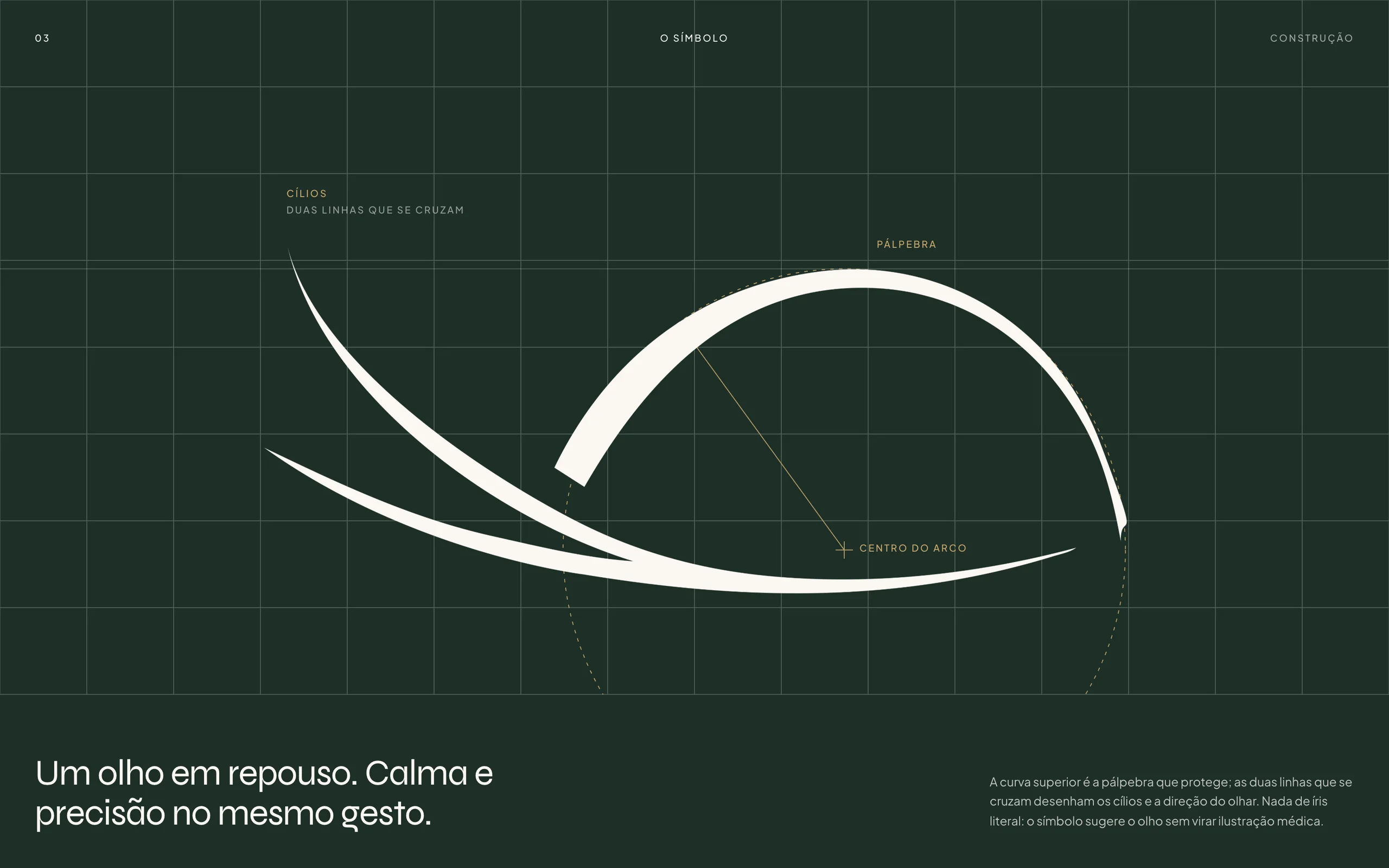
Symbol construction with the eyelid and gaze arcs
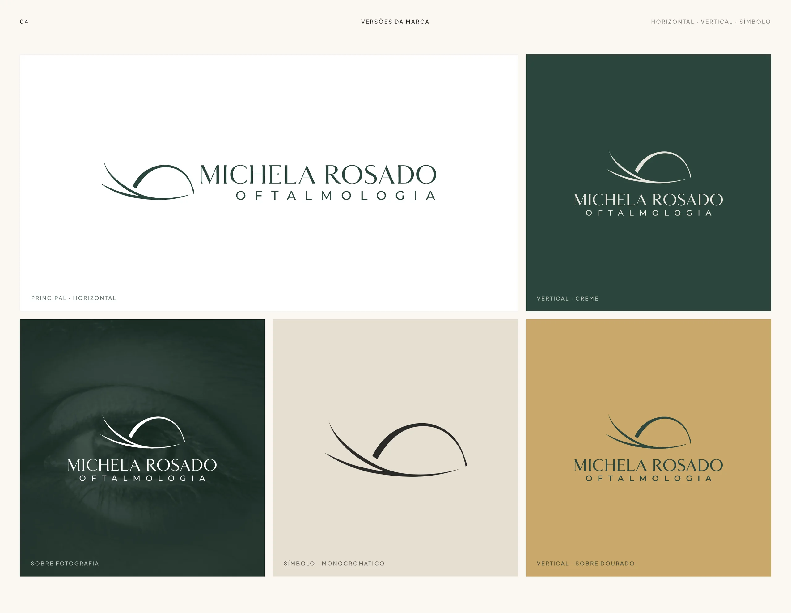
Brand versions: horizontal, vertical, over photography and symbol
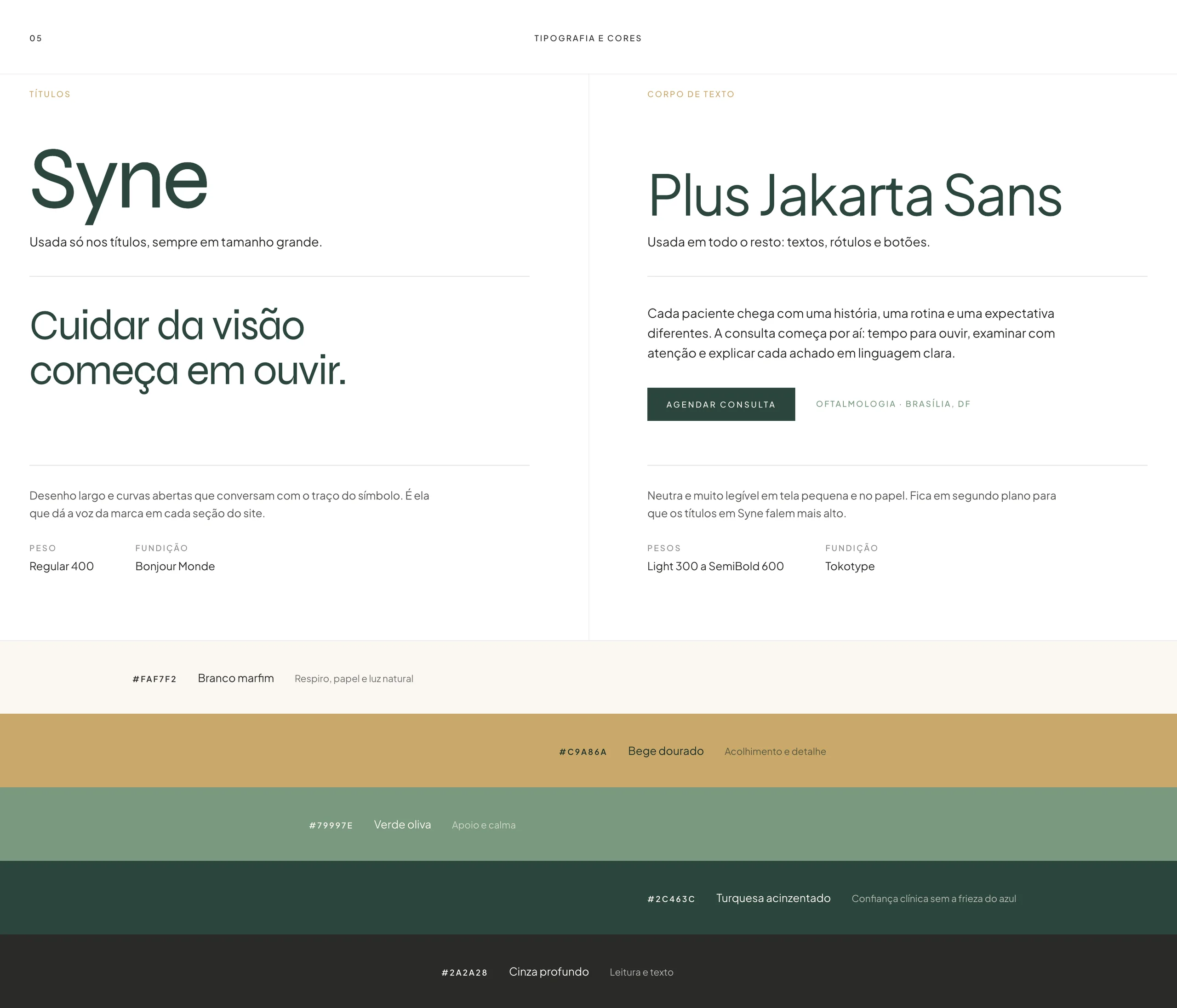
Syne and Plus Jakarta Sans typography and color palette
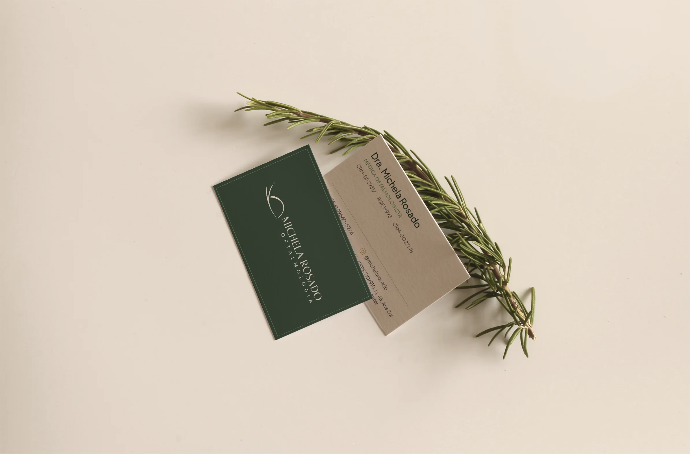
Business cards with a rosemary sprig
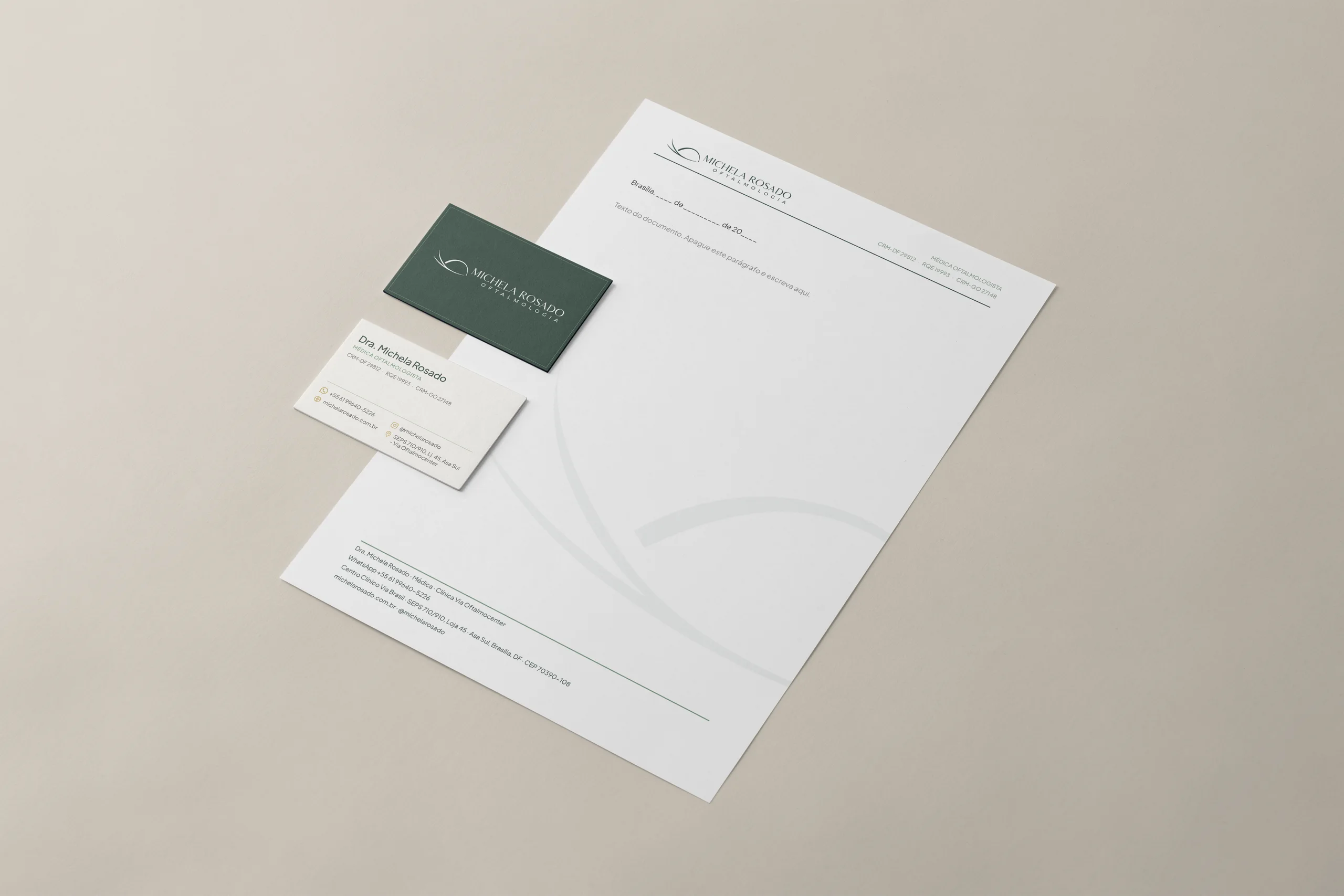
Stationery: letterhead and business cards
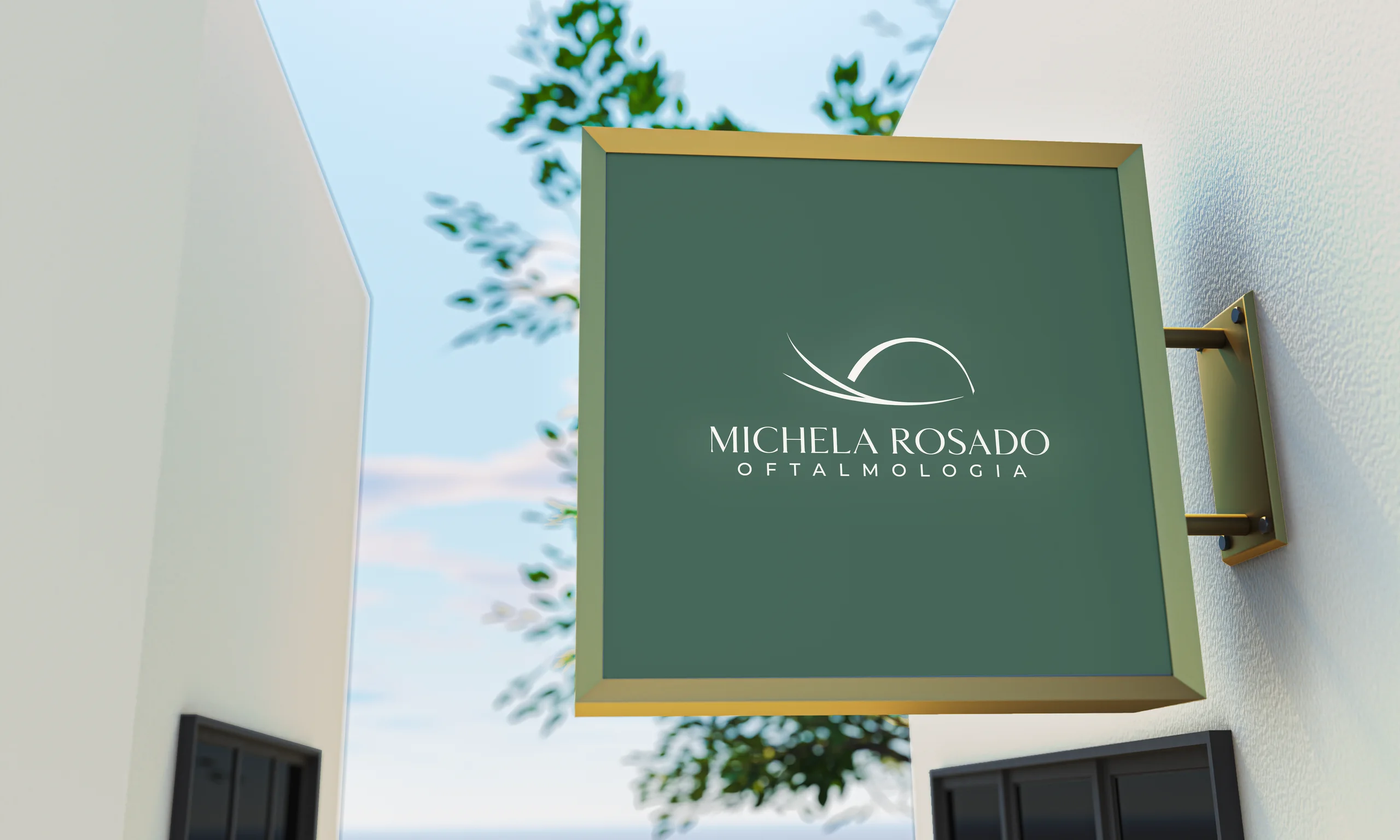
Clinic sign with the logo
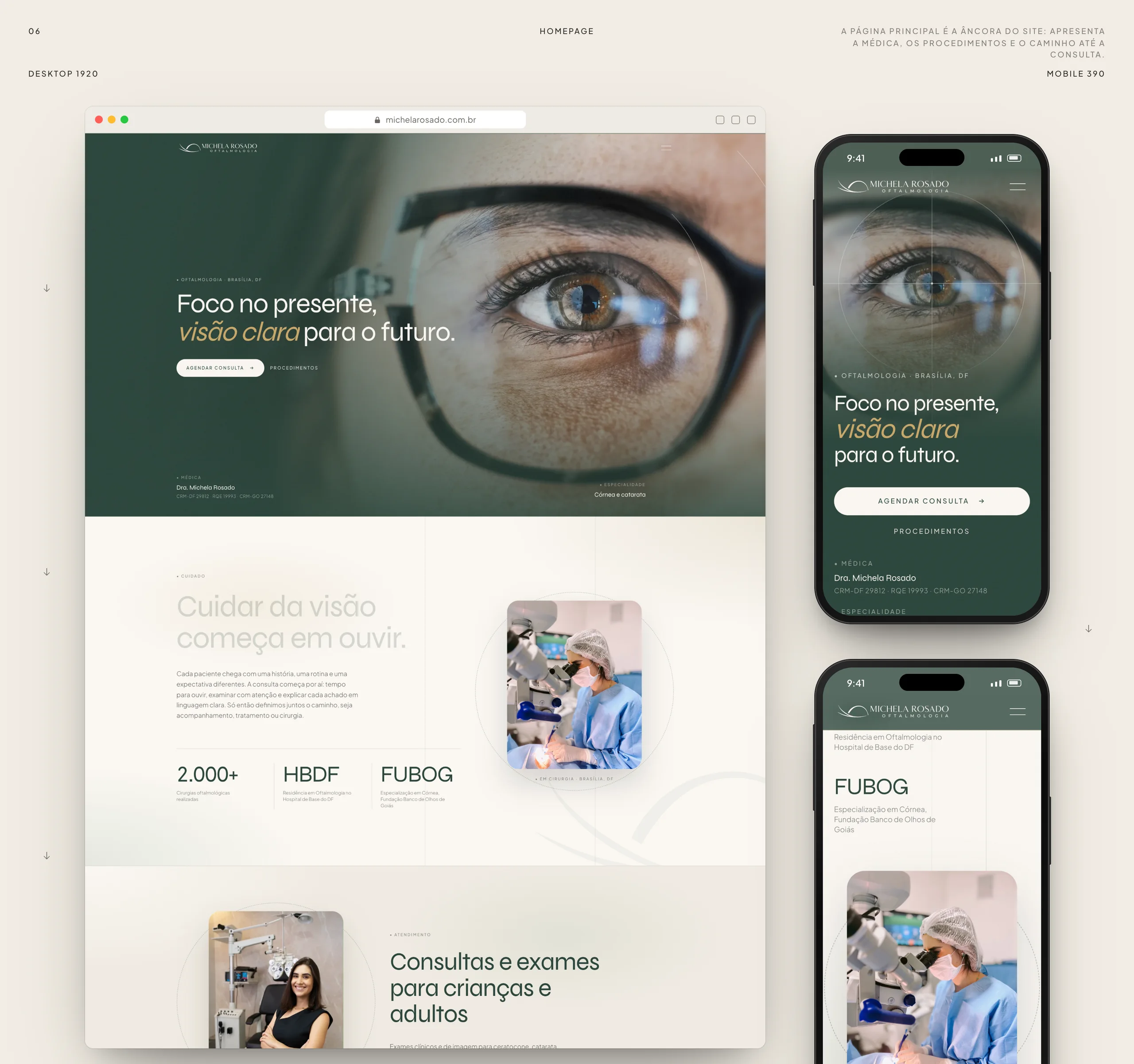
Homepage on desktop and mobile
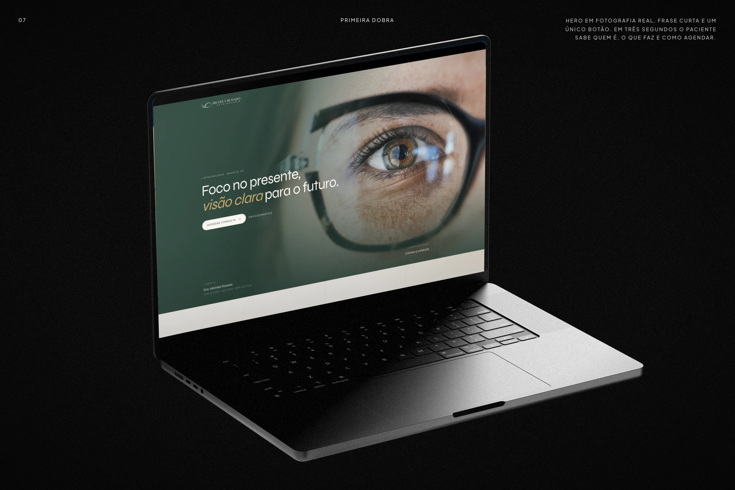
Website hero on a MacBook
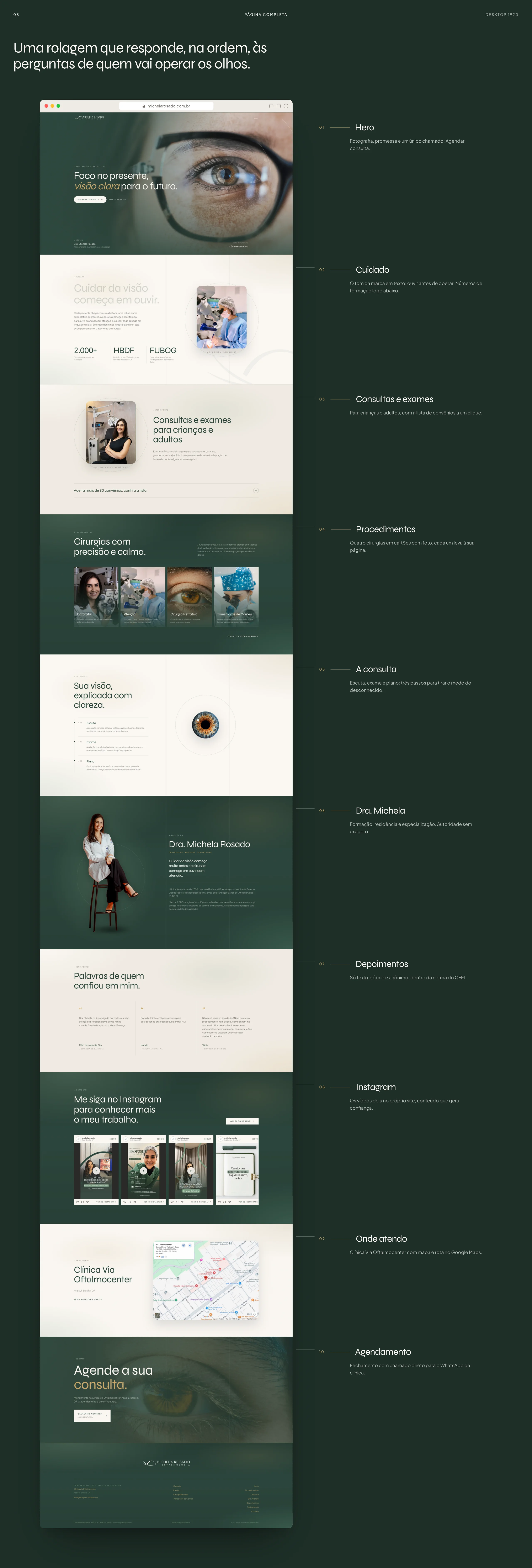
Full desktop page with the role of each section
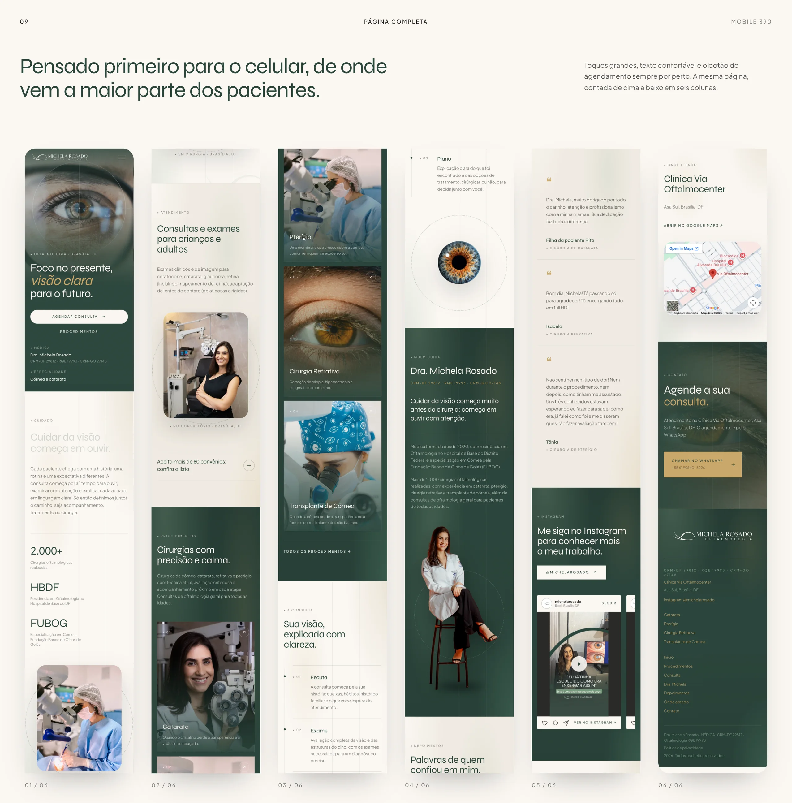
Full mobile page split into six columns
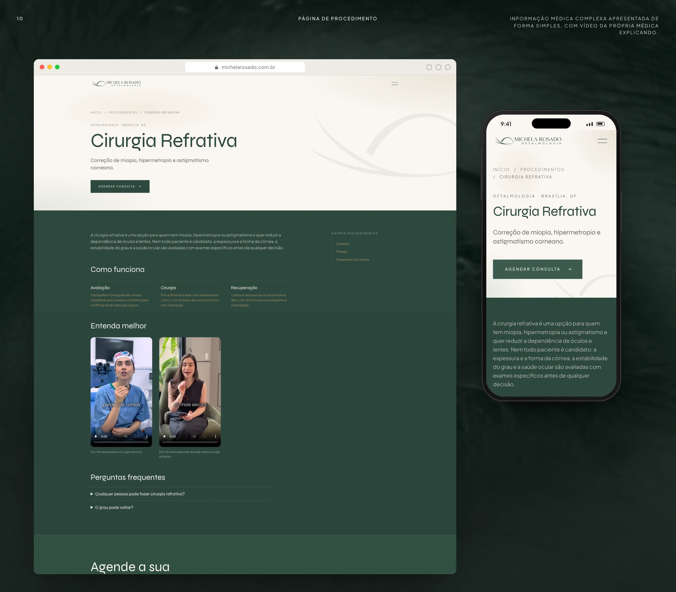
Procedure page: refractive surgery
Mobile screens over eye photography
Closing with the symbol and credits